
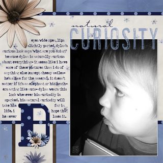
My layout for the critique.

I signed up for a layout design and critique class through Promos4DigiScrappers. The first lesson was on how to critique a layout. Great lesson- awesome experience, so far.
But- I do have a slight complaint. When I posted the above layout, I was expecting to hear more on design type issues and not what I did hear- which was that this layout was too feminine for a boy. Or rather, 'when I first saw this, I thought that it was about a girl'. Someone even commented on having it in a boy's album.
Uh- wait a second. These sound like stereotypical comments. Boys are not all about dirt and mud and bugs and cars. Granted- those are huge factors (I am the only person in this family who has to sit down to pee, afterall) in a boy's life, but it's time to step outside our comfortable little boxes and look at the big picture.
The colors are blues and browns- those a typical boy colors, so the problem isn't there. The problem is in the flowers. Wait. Flowers. Apparently, flowers are too girly for a boy layout. We should be challenged to think outside the box in all aspects of our lives. This includes using florals on boy layouts and dirt browns on girl layouts. Not all little girls are pink and frilly girly girls (one of my step nieces is happier playing in the mud in jeans and tshirt than she is in playing tea party in a frilly lace dress). Not all boys like getting dirty (the son in question here is complusive about keeping his hands clean... and he's not three yet).
Don't get me wrong- I'm not fighting the critiques. What I'm arguing for is that scrapbooking layouts are personal. There's always going to be something that the average viewer doesn't see. There's no way that I could do a layout with flowers on it with my oldest son- flowers don't fit his personality at all. But- I can get away with it on my middle son's layouts because flowers DO fit his personality.
Not all boys fit the stereotypes. I really think that when we are critiquing layouts, we should consider what we don't know about the person in the photo.
1 comment:
I agree on your post, as I grew up with a pink teddy bear so I am opposd to the typecast of certain colors to a specific sex. But then again the pink teddy bear may be why I am a scrapper! LOL!!
some critques on the layout itself...
--I love the colors.
--I like the repeating the polka dots of the letter D with the strips going across the layout.
--nice use of the thirds with the journaling in the left third and the picture taking up the other two thirds.
--the flower embellishments repitition carrys the flow
--nice flow from the large flower to the title to the jornaling and the picture.
--nice use of cursive font for the "natural"
-- nice varity in the fonts
-- nice "stamping" of the second word in the title over the photo
Hope those comments are the type you were hoping for. I can't give you any constructive criticism as I can't find anything I don't like with it.
www.mikescott8.net/scrpabook/albums
Post a Comment